Safara: Building a Better Hotel Booking App
Role: Founding Designer
Dates: 2022-2024
The concept behind Safara is to disrupt the hotel booking industry, which is largely dominated by Expedia and Booking.com, by offering a curated selection of hotels, a universal loyalty program, and enhanced user experience. As the founding designer, I developed an iOS app and led branding initiatives over three years. Initially hired as a freelance designer, I transitioned to head of design in March 2022. Safara functions similarly to other online travel agencies, allowing users to search for a wide range of hotels globally. However, it differentiates itself through a brandless loyalty system that offers up to 10% cashback on bookings and curated hotel recommendations in major travel markets.
As the founding designer, I’m proud that we’ve built something our users care about. We have a 5.0 rating on the App Store, an NPS of 72, a 4.6 score on TrustPilot and over 41% of our first-time hotel bookers become repeat customers.
Branding and Rebranding
The initial branding work for Safara was done by the agency MadeThought and was completed in January of 2022 - two months before I joined Safara as head of design. Unfortunately, this initial branding had limitations in product design, prompting a need for a redesign to better align with the needs of a growing product design footprint. The gold color scheme was not effective for UI components, leading to a reliance on black and white, while the typography lacked clarity for effective hierarchy.
The initial Safara brand created January 2022
The current Safara brand updated July 2023
Due to these branding issues, we hired Red Antler in Spring 2023 to develop a new brand identity. The updated brand features appealing cool blues and vibrant colors, along with a versatile sans serif font, National. The visual collages of textures and travel photography improved upon the idea of the ephemera, and the new logo appears modern and playful. Once the new brand was established, I focused on transitioning the existing UI to align with it without a complete redesign. To facilitate this, I created a color theory guide to streamline color usage for our developers.
Rebrand color rules
NOTE: Due to this rebrand, many of the product iterations you’ll see in this case study will include both the original brand and the updated branding we currently use.
Creating the Core Booking Flow
The initial Safara app design focused on the basic booking flow: search, hotel details, and booking completion. We initially considered a subscription model but pivoted away from it to promote growth. We also shifted from exclusively showing curated hotels we could recommend to displaying our worldwide inventory, while including curation as an optional filter. This change required implementing a toggle for curated results and adding curation badges to hotel search cards.
Competitive Analysis Feb 2022
Early Wireframes Feb 2022
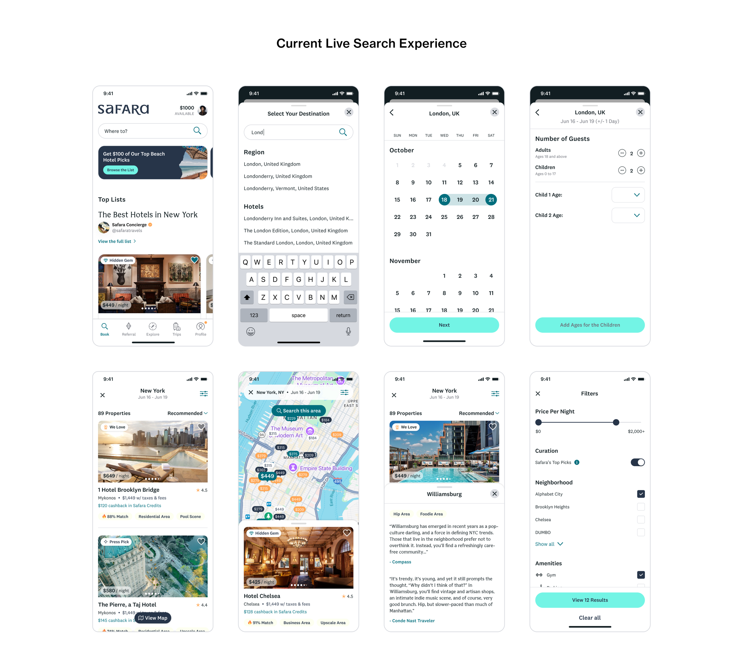
Search
We made several important product iterations to search to better help users find the right hotel. The first was adding contextual tags to hotel cards in search results. These tags describe the neighborhood (eg residential area, hip area, etc) or highlight an aspect of the hotel itself (pool scene, lively bar, etc). The area tags can be tapped for more information. We also added in user rating scores based on Expedia data, and we gave users the ability to save hotels to make it easier to come back to something you liked. Lastly, we created a convention to auto-apply any promotional offers a user has to the price they see in search results to make it clear that the price the user will pay is less than the display rate.
Some Search Results Iterations

Hotel Detail Pages
We also went through several iterations of our hotel detail page. The first iteration was visual enhancements including increasing the height of the hero image and changing the font of the hotel name from our workhorse sans serif, National, to our more expressive hero font, Bianco Serif. Additional changes included adding contextual tags (as mentioned in search iterations), including guest reviews, and using AI to rewrite the hotel descriptions on our site to be more dynamic and useful.
Some Detail Page Iterations

Checkout
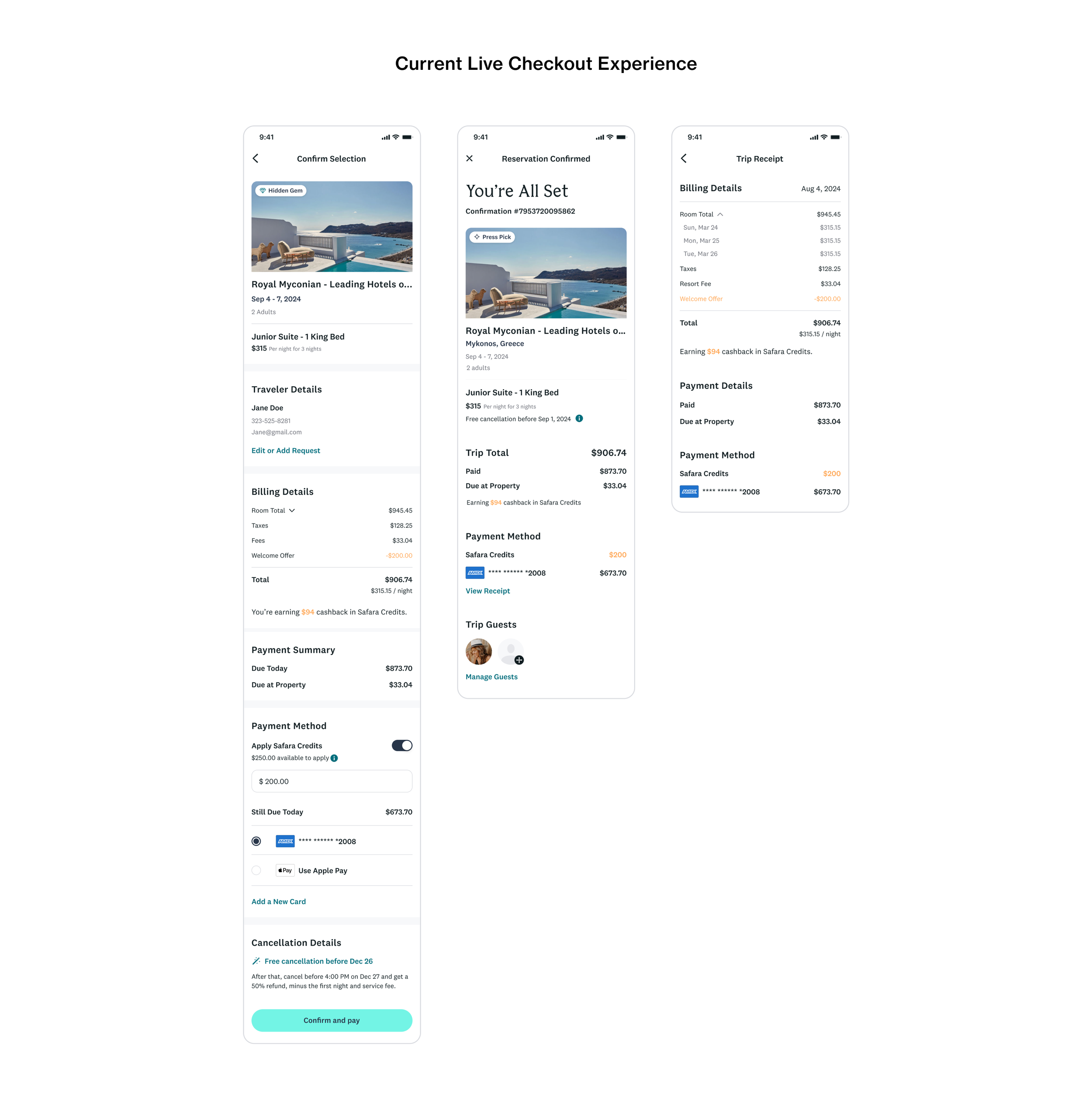
Our checkout experience underwent far fewer feature-level changes than other areas of the product, but how we organized and laid out information was something we iterated on a great deal. Our first change was trying to show how credits applied to the price more clearly. However, showing credits as a discount was not ideal when we added actual promotional offers, and the overall organization of the receipt was messy. This led to reworking not only the receipt itself but making the entire checkout experience a single screen.
Some Checkout Receipt Iterations

Trips
Trips is the section of the app where users can see and manage their hotel bookings. This is another area of the product that has not seen extensive iteration from the initial design. What we have done, however, is add features. The first feature we added was the ability to add a friend to a trip. This not only provides convenience for people traveling together but serves as a growth lever for Safara. The second feature was providing users with a self-serve pathway to cancel their reservation. Obviously, this isn’t something we want users to do, but making them go through our customer support team to cancel a booking simply created more overhead for support and was a bad experience for our users.

Profile
The user profile section of the app went through three key changes. First, we added a passport section that lets users track which countries they’ve visited. Next, as mentioned in the search section, we gave users the ability to save hotels with their master list of saved hotels living in their profile. Lastly, we moved from giving all users 10% off of every booking to a more traditional tiered loyalty program where cashback is determined by status which in turn depends on annual spend. Profile is where a user can track their current tier and progress as well as find an overview of our loyalty program.
Some Profile Iterations

Conclusion
There’s even more to the Safara app like Referrals and Explore, which is a tool we built to help users discover new destinations. And of course, there’s even more to be said about how we built all these features, the user feedback, the tests, the hits and the misses. But for brevity, I’ll conclude the case study here. Creating this app with the team at Safara has been without a doubt the most rewarding project of my career, and I’d love for you to check it out for yourself on the App Store.

