quip: Redesigning the App Homescreen
Role: Sr Product Designer
Dates: 2020-2021
quip is a direct-to-consumer oral care company, most famous for its toothbrushes. In July 2020, I was tasked with redesigning the newly launched quip mobile app, which paired with the Bluetooth-enabled Smart Brush. This brush utilizes sensors to track brushing duration, force, and distribution between upper and lower teeth. The app not only tracks this data but also rewards users with points for brushing at least two minutes and maintaining streaks.
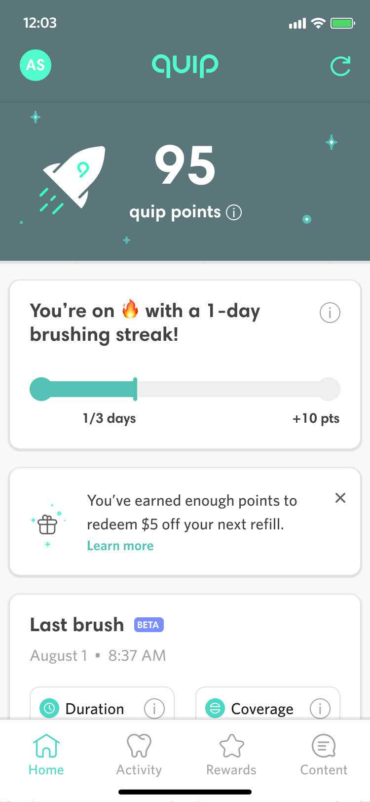
Upon taking over the app's design, I identified the need for a complete overhaul of its visual language, especially the main dashboard. The existing design (shown below) lacked branding and a clear content hierarchy, making it difficult to navigate. Many elements, such as last sync time and connected brush status, were irrelevant for most users, as over 90% connected only one brush. This had led to critical App Store reviews and a low rating of about 2.7 stars, which seemed to be hindering broader adoption of the brush.
The Old Designs
Ideation
My first step was to perform a quick competitive analysis of other apps to see how home page content was laid out and organized. I then quickly sketched out how some different layout and component conventions could work. I was particularly interested in different approaches to the header and the use of bottom sheets to pin content.
Initial UI Designs
Some parts of the existing app design, like the rewards tab and the individual brush event details pages within the activity tab, already used a card-based UI, and it seemed like this would be a solid starting point for revamping the app’s design language. A modular, card-based UI, would not only make it easier to implement new features but would support a more dynamic approach to displaying the most relevant content to a given user. My initial pass was a simple, clean system of white cards on a grey background. I kept UI functionality largely the same but added a logo for branding and moved the points and streak out of the accent color dominant green area and into some card treatments.
First High Fidelity Explorations
Cleaning up Brush UI
I redesigned the app's top section, which previously displayed infrequently used information like brush selection and last sync time. This was inefficient since most users only connect one brush, and sync time is only relevant upon initial app load.
However, the new design still needed to support connecting multiple brushes to an account, so I consolidated brush information and settings into a profile-style circle with brush name initials. Tapping this opens a bottom sheet with links to settings and notifications. On app launch, a temporary toast displays the currently connected brush, and a refresh link allows users to resync and view the brush connection status as needed.
Brush Switching UI in Profile
More Header Explorations
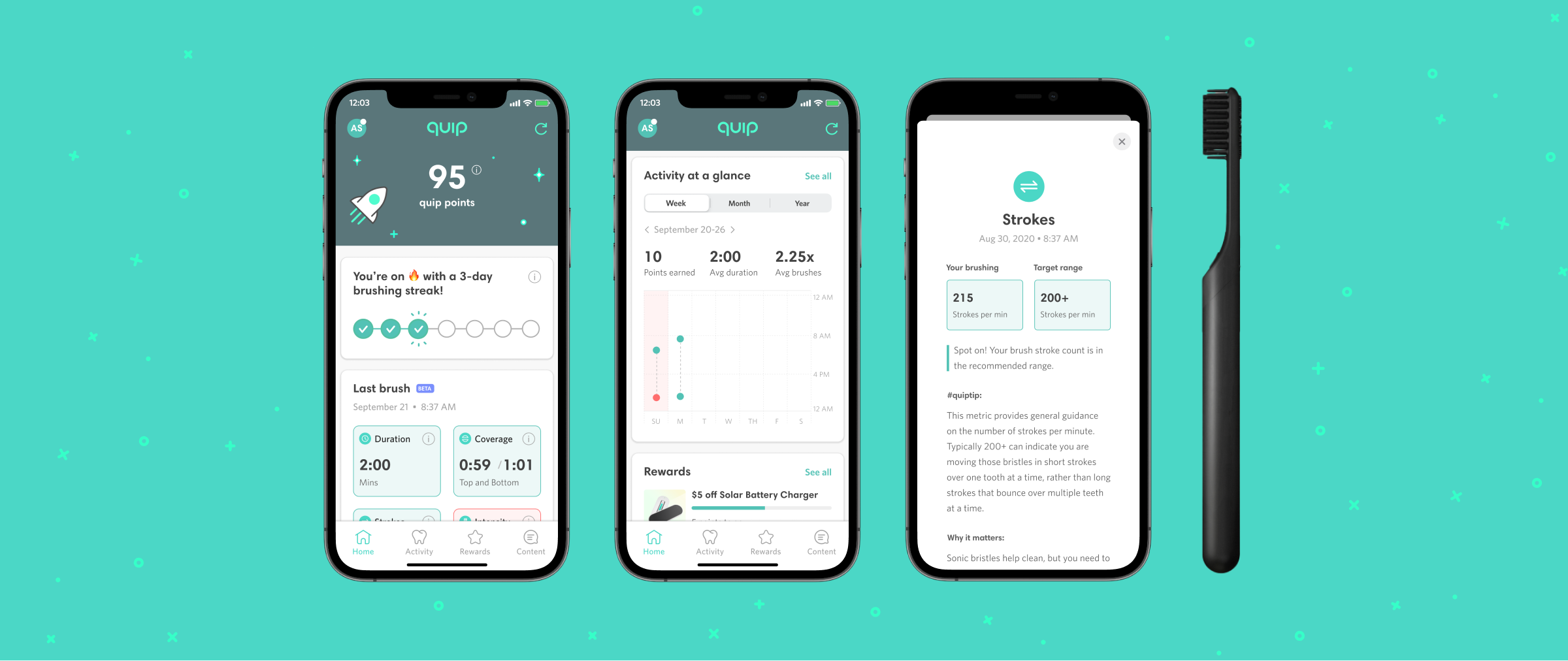
The next step in the process was to address feedback from our CEO, Simon, about making sure that the app had a true hero area and that the top section retained some aspect of the classic quip forest green as a branding element. After some discussion, we agreed that the likely most relevant hero content for a user is the number of reward points that they’ve accrued. I further proposed that we could make this feel more like a true hero area with illustration and graphical treatment of the hero area. After a number of explorations, we settled on an animated prototype I had created to position the points in the center of a starry night sky of subtly twinkling stars and lights with a single rocket ship animating past the left side. I then worked with our motion graphics designer to finalize the animation in lottie files for handoff to dev.
Finalizing the Header Designs
Continued Multi-brush Iteration
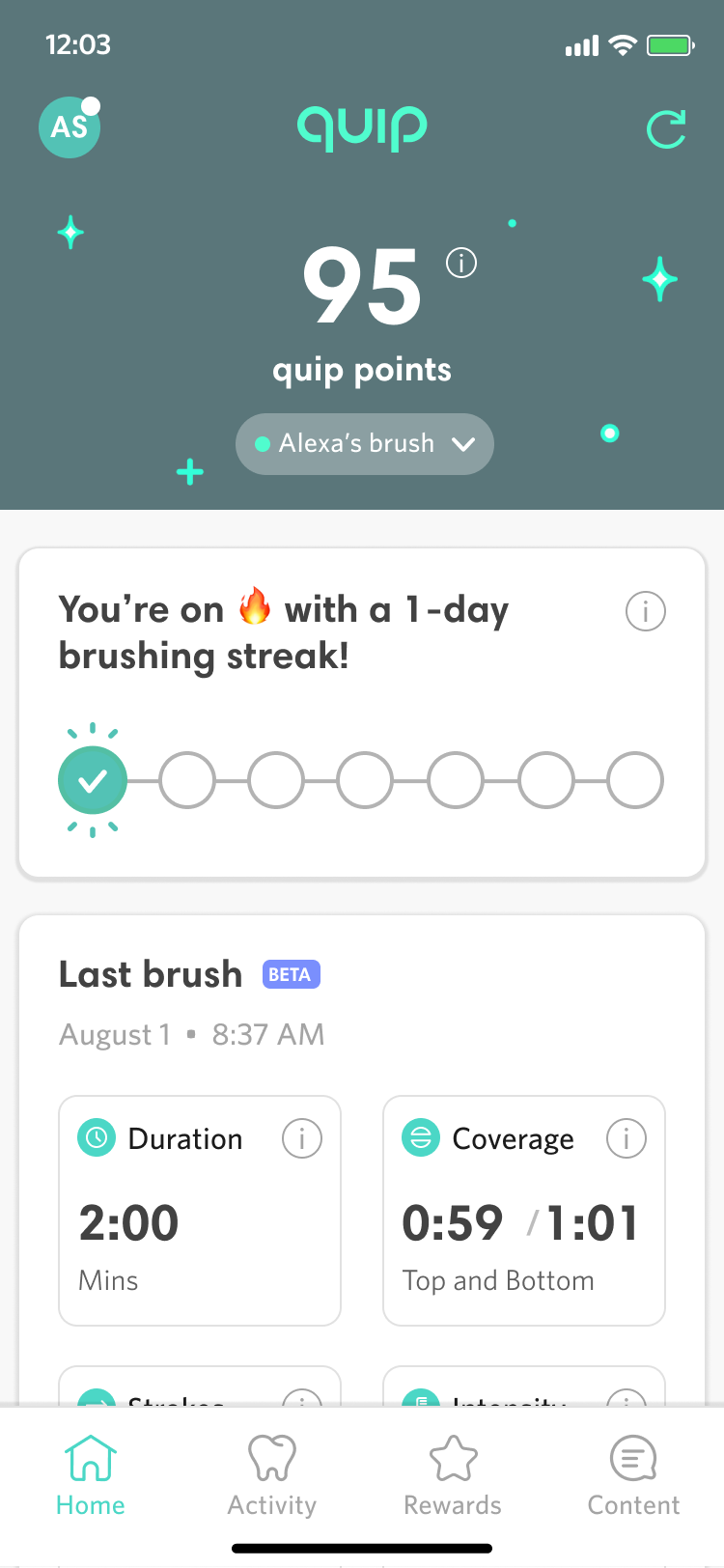
Our stakeholders challenged us to improve the design for users with multiple brushes, concerned that the initials-only approach might not clearly indicate the brush-switching function. We considered combining initials with brush color swatches, but this proved aesthetically problematic and ineffective for differentiating children's brushes, which only came in yellow.
The solution I settled on was to add a UI element for switching specifically for users with multiple paired brushes. These users would see a brush dropdown on the dashboard, placed directly below the points total, ensuring clarity for multi-brush users while maintaining simplicity for the majority with a single brush.
Multibrush Solution
Enhanced Coaching
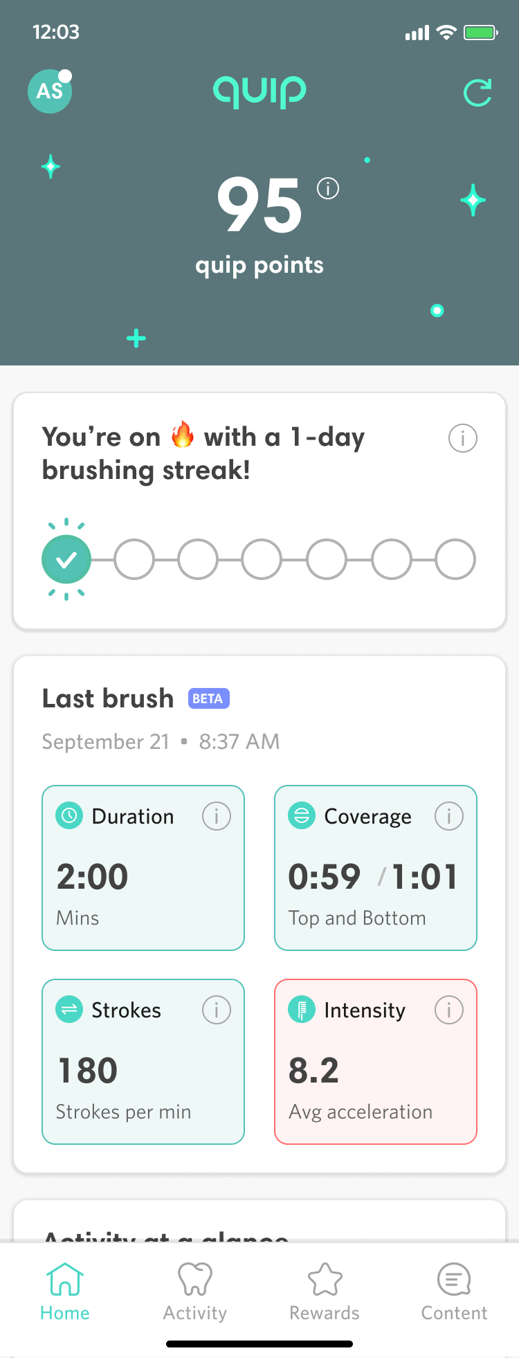
With our new UI in place, we aimed to enhance the dashboard's utility. The original design displayed four key brushing metrics—duration, upper and lower teeth distribution, up and down strokes, and brushing intensity—but lacked context. Users could click an “i” icon for definitions, but it didn’t provide guidance on what constituted good or bad numbers.
Collaborating with the product team, I advocated for our dental and hardware teams to establish ideal ranges for these metrics. I then color-coded the last brush values: red for out-of-range and green for within range. Tapping the information icon or the metric cell now reveals a detailed view comparing user data to target ranges, along with actionable guidance.
During internal user testing, we found that retaining the information icons in the upper right corner of each color-coded metric card was crucial; without them, users were less likely to realize they could click for detailed explanations.
Coaching on Dashboard and Detail Views
Results
The quip homescreen redesign went live in March of 2021. As a designer, I would have liked for use to be able to evaluate detailed metrics for engagement like average number of daily users, session duration, and micro interactions with new features like coaching tips. But due to limitations of our analytics implementation, the best metric available is the overall App Store rating.
We reset our App Store rating, which had been just 3.1 stars, shortly after the redesign went live, and roughly two months after the redesign the App Store rating is a much improved 4.7 stars.
You can view the Figma prototype or see a video of it below.


